It is a Tuesday afternoon at a hardware shop on the Udupi bypass. A delivery has arrived and the boy at the counter is entering it into the billing software on his phone, because the one computer in the shop sits behind the owner's desk and the owner is on a call. He is holding the phone in his left hand and the delivery challan in his right. He pinches the screen to read the rate column. He taps what he thinks is the quantity box and lands on the one beside it. He zooms out, zooms back in, and tries again.
Nobody is going to report this. The software is not broken. It opened, it loaded, it looks roughly like it does on the computer. The entry takes him four minutes instead of one, and on a busy day he will stop bothering with it and write the delivery on paper for somebody to key in later.
That is how software quietly stops being used. Not with a complaint, but with a workaround.
"It fits on the screen" is the lowest bar there is
Last week we went through ten screens of a working stock and billing system at the width of a common phone, 390 pixels. The first thing we checked was whether anything spilled off the edge. Nothing did. Every page fitted. By the usual test of whether software is mobile friendly, it passed.
It was still hard to use, and every reason was something we could measure.
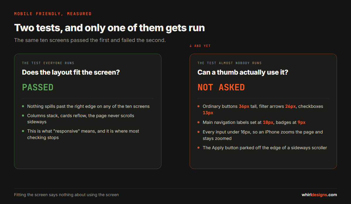
This is the part most owners never hear. "Responsive" means the layout rearranges itself to fit a narrow screen. It says nothing about whether a person can hit the buttons, read the numbers, or find the one that saves the work. Those are separate questions, and they are the ones that decide whether your staff actually use the software away from a desk.
The six things that actually break
1. Buttons smaller than the thumb that has to hit them
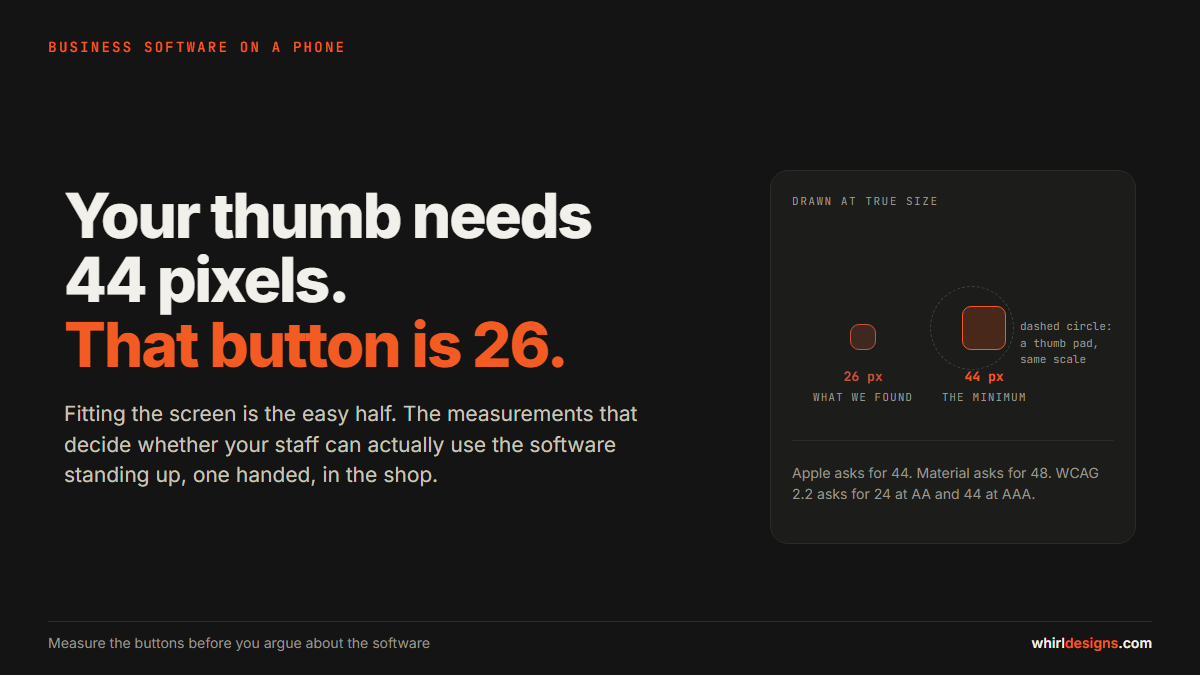
A finger touching glass is not a point. It is a patch, and it is larger than people expect. This is why every major platform publishes a minimum size and why those minimums are all fairly big.
Apple's guidance for iPhone has been 44 points square for years. Google's Material Design asks for 48 density-independent pixels. The Web Content Accessibility Guidelines, in version 2.2, set 24 by 24 CSS pixels as the minimum at level AA, and 44 by 44 at the stricter level AAA. The numbers differ because the organisations measure differently, but none of them is small.
On the system we went through, the ordinary buttons were 36 pixels tall. The smaller ones were 30. The little arrows that scrolled a row of filters sideways were 26 by 26. A checkbox, left at whatever the browser does by default, was 13 by 13 pixels. That is about the size of a grain of rice.
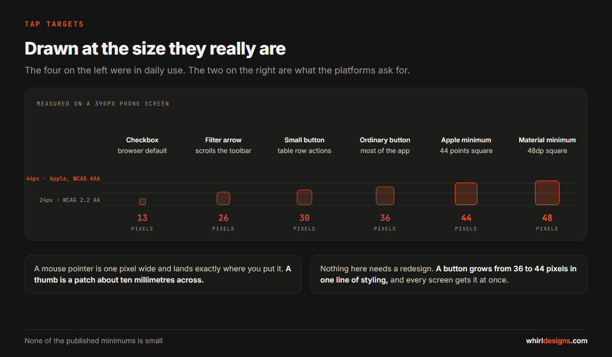
You never notice this on a computer, because a mouse pointer is effectively one pixel wide and it goes exactly where you put it. You notice it immediately on a phone, and the way you notice it is that you miss.
2. Text you have to bring closer to your face
On the same screens we found badges set at 9 pixels, section labels at 10, and price figures at 11. The worst one was the row of labels along the bottom of the screen, the Home, Sales, Stock and Reports buttons. That is the main navigation of the entire application, present on every screen, set at 10 pixels.
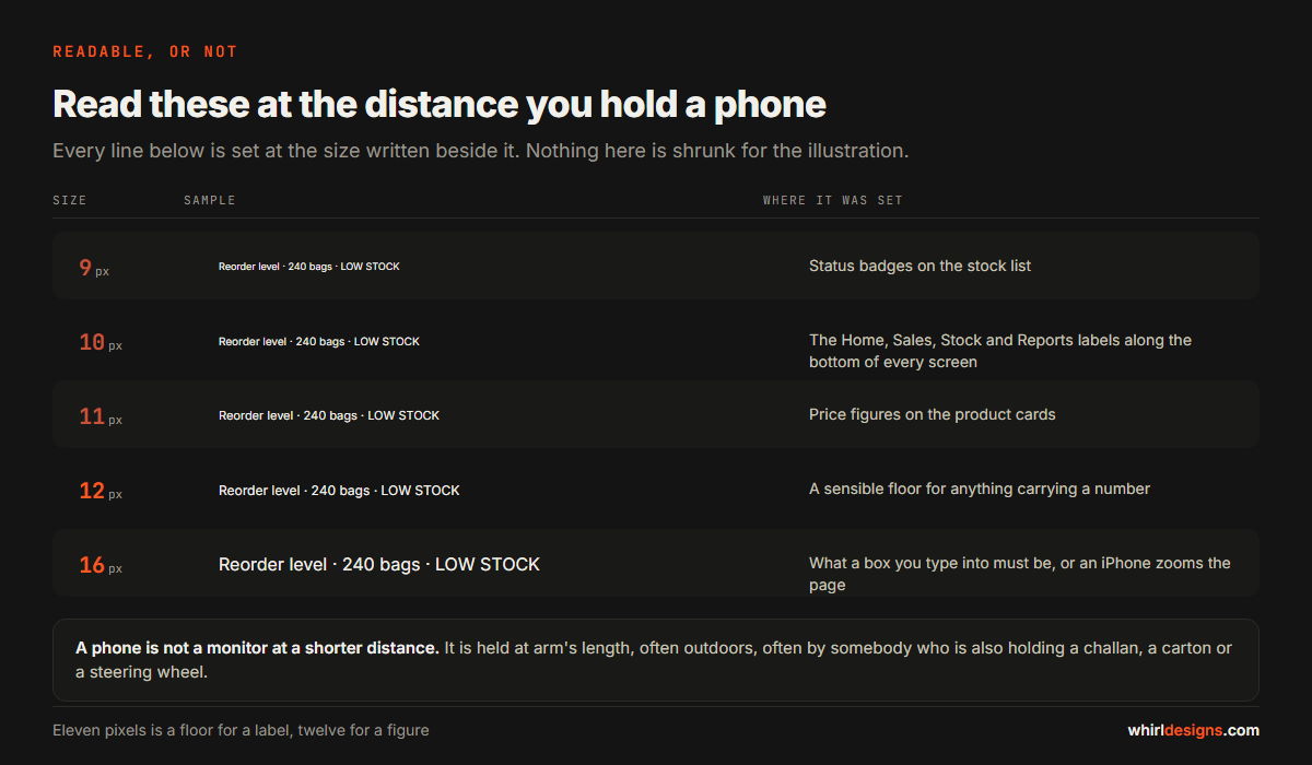
Small text on a phone is a different problem from small text on a monitor. The monitor is at a fixed distance in an office with the lights on. The phone is held at arm's length, often outdoors, often by somebody who is also holding a challan, a carton or a steering wheel.
Eleven pixels is a reasonable floor for a label. Anything carrying a number somebody will act on, a price or a quantity, wants twelve or more.
3. The form box that zooms the page and will not zoom back
This one is specific to iPhones and it catches nearly everybody.
If you tap into a box you type in, and the text inside it is set smaller than 16 pixels, Safari zooms the whole page in so that the text becomes readable. That part is helpful. The part that is not is that it does not zoom back out when you finish. You are now panning around a page half again too large, hunting for the Save button that used to be on screen.
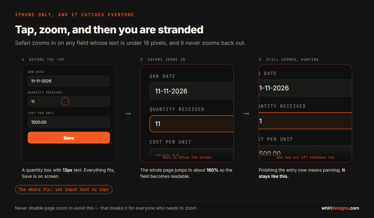
The fix is one line of styling: set the text inside input boxes to 16 pixels. There is a trick that disables zooming on the page altogether to avoid the problem, and it should not be used, because it also stops anybody who needs to zoom from doing so.
4. Tables with nine columns
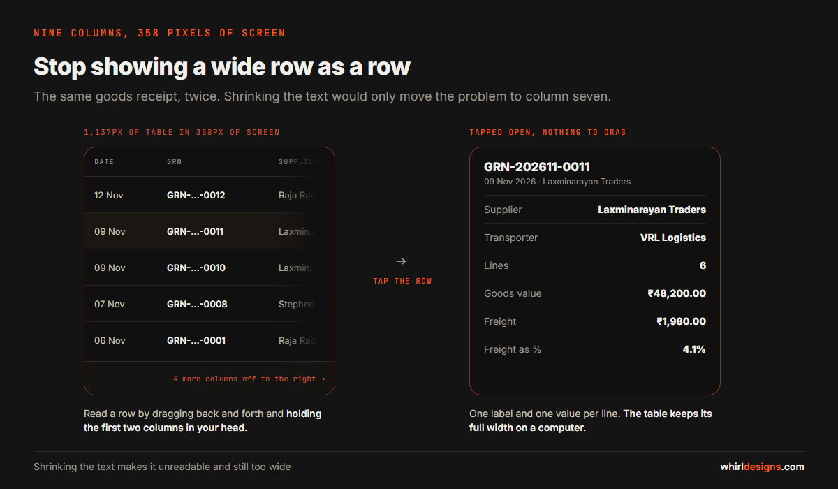
One report we looked at had a table nine columns wide. On the phone it came to 1,137 pixels. The usable width of the screen was 358. The table sat inside a box you could scroll sideways, which is honest enough, but reading a row meant dragging it back and forth and holding the first two columns in your head.
The usual reaction is to shrink the text until the table fits. Do not do that. You now have a table that is both unreadable and still too wide, and you have moved the problem from column four to column seven.
What works is to stop trying to show a wide row as a row. Let the person tap it, and show the whole record as a list instead, one label and one value per line, in a panel that slides up from the bottom. Every column is then readable without any sideways movement at all, and the table underneath can keep its full width for anyone on a computer.
5. The control hidden inside a sideways scroller
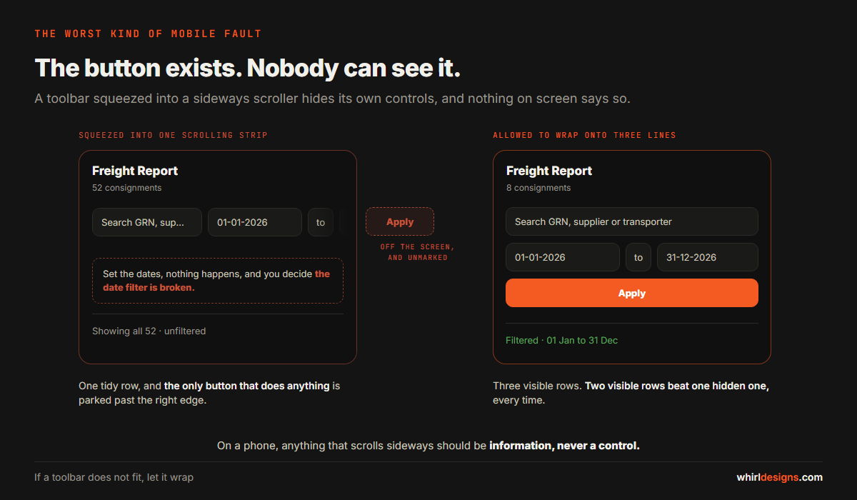
The filter bar on those report screens held a search box, two dates, an Apply button and the export buttons. On a narrow screen that row turned into a strip you could swipe sideways. It looked tidy in a screenshot. The Apply button sat just past the right edge, invisible, with nothing on screen to suggest anything was there.
This is the worst class of mobile problem, because the person does not know they are missing something. They set the dates, nothing happens, and they conclude that the date filter does not work. Then they stop using the report.
Anything that scrolls sideways on a phone should be information, never a control. If a toolbar does not fit, let it wrap onto a second line. Two visible rows beat one hidden one every time.
6. Things that land outside the box they belong to
On a goods receipt screen, the small remove button beside each freight charge was pinned to a fixed distance from the right edge. On a computer that put it neatly at the end of the row. On a phone, where that row rearranged itself onto two lines, the same instruction left it sitting on the card's border, half outside the panel it belonged to.
Nobody had broken it. It had simply never been looked at on a narrow screen, which is the honest explanation for most of what goes wrong here.
How to check your own software in ten minutes
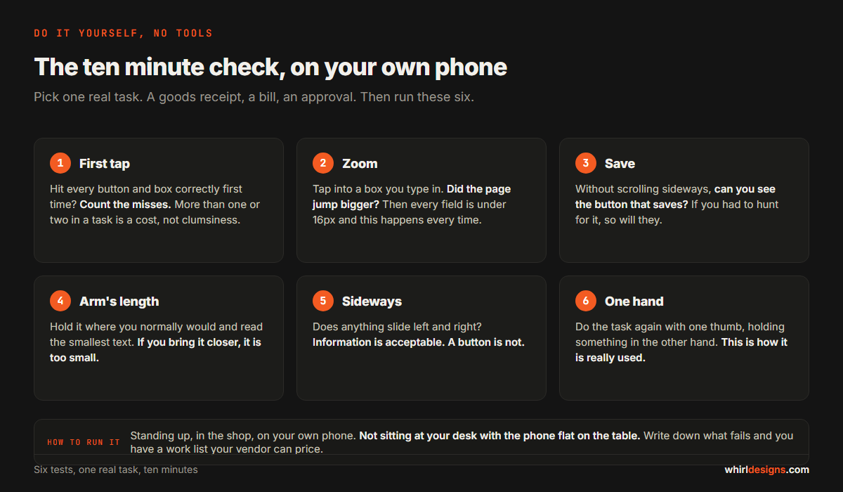
You do not need us for this and you do not need any tools. Take your own phone, open the software, and try to complete one real task from start to finish. A goods receipt, a bill, an approval. Do it standing up, with one hand, in the shop. Not sitting at your desk with the phone flat on the table.
- The first-tap test. Can you hit every button, box and checkbox correctly on the first attempt? Count the misses. More than one or two in a single task is a real cost, not clumsiness.
- The zoom test. Tap into any box you type into. Did the page suddenly jump bigger? If it did, every field on that screen is under 16 pixels and this will happen to your staff every single time.
- The save test. Without scrolling sideways, can you see the button that saves, applies or submits? If you had to go looking for it, so will they.
- The arm's length test. Hold the phone where you would normally hold it and read the smallest text on the screen. Labels, totals, status badges. If you move it closer, it is too small.
- The sideways test. Does anything slide left and right? Note whether it is information, which is acceptable, or a button, which is not.
- The one-hand test. Do the whole task again with one thumb while holding something in your other hand. This is how it is actually used.
Why this costs money and not just patience
It is easy to file all of this under polish. It is not polish, and here is where it actually shows up in the accounts.
A mis-tap on a billing screen is a wrong figure that gets saved. Nobody loses an afternoon to a missed button. They lose a quantity. The 11 becomes 111 because the thumb caught the stepper, and the mistake is now in your stock, your invoice and your GST return. Small targets do not just slow people down, they produce bad data.
The approval that waits until tomorrow. If a supervisor cannot comfortably approve a purchase order on a phone, it will not be approved on a phone. It waits for the desk. A one-day delay repeated across a year is the quiet reason your purchase cycle is slower than you think it is.
Staff route around it. This is the serious one. When software is painful on a phone, people do not escalate, they go back to what works: paper, a photo on WhatsApp, a message to whoever sits at the computer. Your records end up in a chat thread, and the system you paid for becomes a place where yesterday's work is typed in late.
What to fix first
You do not have to do all of it, and the order matters more than the total. Roughly in order of return:
- Every box people type into. Text at 16 pixels so the page stops zooming, and a height of 44 pixels so it can be tapped. This is the single highest-value change on the list.
- The buttons that save, apply and submit. Make them big and make sure they are never inside something that scrolls.
- Anything under 11 pixels. Start with whatever appears on every screen, which is usually the navigation.
- The widest table you have. Give it a tap-to-open detail view rather than shrinking it.
- Everything else, once the four above are done and somebody has used it for a week.
Almost all of this lives in one stylesheet. On the system we went through it was a single file, changed once, which fixed the same problems on every screen at the same time. That is normal. It is usually a day or two of work, not a rebuild, and a good part of why it had never been done is that nobody had put a number on it. See also design and usability work and fixing software you already own.
The thing that is usually not the answer
When an owner finds the software awkward on a phone, the suggestion that comes back is often "we should build an app". Sometimes that is genuinely right, and we have written about how to tell when it is.
Most of the time it is not. Building a native app for Android and iOS to fix what is a styling problem is an expensive way to arrive at the same buttons at the same sizes, except now there are two more things to maintain and an app store review between you and every correction. If what you actually want is for the existing system to work properly on a phone and to open from the home screen like an app does, that is a much smaller job.
Decide that question on a capability you can name, not on frustration with a stylesheet.
Measure it, do not argue about it
"The software is hard to use on the phone" is an opinion, and your vendor is free to disagree with it. "This button is 26 pixels tall and the published minimum is 44" is a fact, and it comes with its own definition of done.
So ask for numbers. How tall are the buttons. What size is the smallest text. Do the input boxes trigger zoom on an iPhone. How wide is the widest table against the width of the screen. Ask for the same measurements again after the work, because that is what turns a vague improvement into something you can confirm yourself in ten minutes with your own phone.
The boy at the hardware counter was never going to raise a ticket. He was just going to be slower, and then one day he was going to stop. The measurements are how you find out before that happens.
If your team is using business software on phones and you suspect it is not holding up, we look at exactly this for businesses around Udupi, Mangaluru and the towns between, and we will tell you plainly when the honest answer is a stylesheet and not a rebuild. You can talk to us here.