UI/UX design · Udupi & Mangaluru

Screens people understand without being shown

We design the screens of apps, websites and business software, test them with the people who will use them, and can build them exactly as drawn. One studio in Udupi does both, and keeps refining the screens once people use them.

Demo screen with made-up data.
Clickable prototype
tried on your own phone before any build
Tested with real users
your customers or staff, not only us
Built as drawn
built screens checked against the design
Files are yours
design files and assets in your own account

In short

What does a UI/UX design company do?

A UI/UX design company plans the screens of an app, website or business software, then tests them with real users before anything is built. At its Udupi studio in coastal Karnataka, Whirl Designs begins by watching your customers or staff do the task. It turns what it sees into practice screens they can tap through, fixes what confuses them, and can build the final version as drawn.

Updated · Whirl Designs, Udupi

Start here

A UX audit, design only, or design and build?

Design work comes in three sizes. Which one you need depends on whether the product already exists, and who will build it.

A UX audit of what you have

Best for: A working site or app where people get stuck

  • Real users try your main tasks while we note each place they stall
  • A written list of fixes, the most important first
  • You choose which fixes to make, and who makes them
Design for your own developer

Best for: You already have someone to build it

  • Every screen drawn in Figma, a common design tool, and clickable on your phone
  • Your developer takes sizes and colours straight from the files
  • Their questions answered while they build

Design and build together

Best for: A new app, website or business system

  • Research, prototype and final screens from one studio
  • Nothing gets lost between the designer and the builder
  • Changes after launch come from the people who drew it

If the trouble is a hidden button or unclear words, an audit and a few fixes will do, and we will not sell you a full redesign.

Our work

A site where the photos do the selling

Avi's Events & Management
Events & weddings · Udupi

Read the full case study →
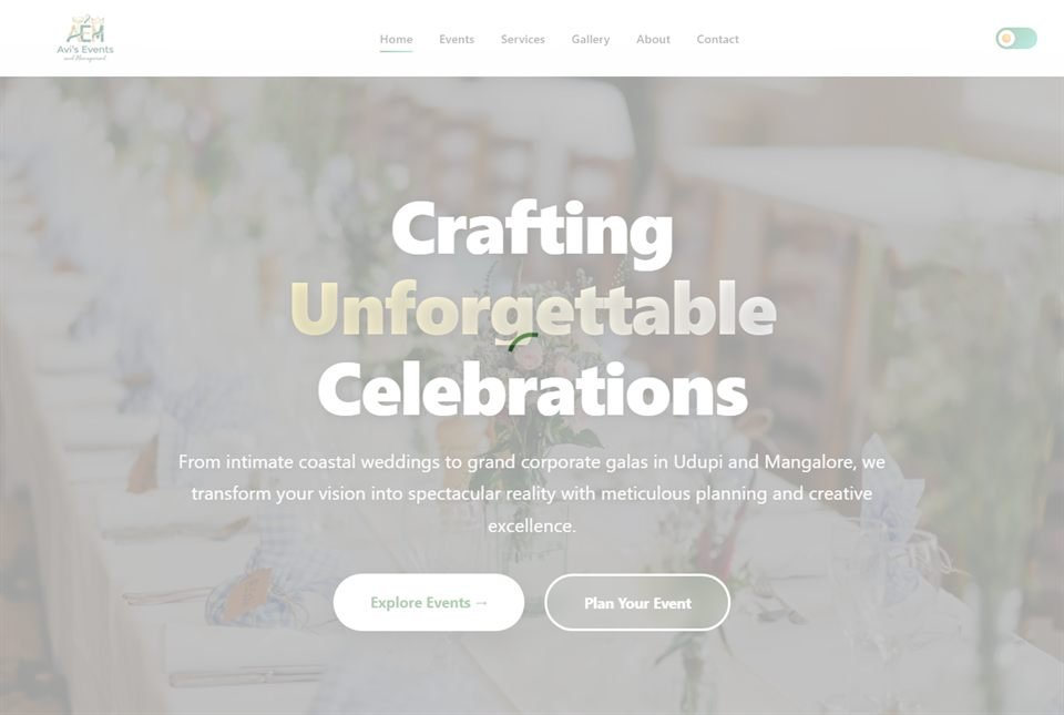
Avi's Events & Management — screenshot of the live site
Live site: avisevents.in

Avi's Events & Management plans weddings and events in Udupi. Their work is entirely visual, so the site had two jobs above all others: let the photographs lead, and make the enquiry the easiest thing on the page.

Every service is laid out around its gallery, with the photographs ahead of the text. The enquiry form can be reached from every screen, so a visitor who likes what they see never has to hunt for it, and the pages are built to stay fast on mobile data, even when someone opens them at a venue.

  • Gallery-led layout across every service
  • An enquiry form within reach on every screen
  • Built for the way people in Udupi and Mangaluru search
  • Fast on mobile data at a venue

Also built by us

What you get

What every design job includes

These are the parts that get skipped when a job is rushed. None of them is skipped here, and the written plan names each one.

  1. Phone first, on ordinary phonesMost of your customers and staff will meet these screens on a mid-range Android phone, often on mobile data and with one hand busy. The phone layout is drawn first, with the main buttons where a thumb can reach, and the computer layout follows.
  2. Plain words on every buttonLabels, messages and error notes are written as part of the design, not added at the end. A button that says what happens next, such as 'Send enquiry', leaves less to guess than one that says 'Submit'.
  3. The moments when things go wrongWhat a screen shows when a list is empty, while it loads, when the signal drops, when a name is very long or when a payment fails. These are the moments that make people give up, so each one is drawn, not left to chance.
  4. One set of partsColours, type, buttons, form fields and cards are defined once and reused on every screen. Designers call this a design system. The product feels like one thing, and new screens later take less time because the parts already exist.
  5. Checked so everyone can use itContrast, text size and tap size are checked against the web's accessibility guidance (WCAG), so screens stay readable in bright sunlight, for older eyes, and with a phone's screen reader.
  6. Notes for whoever builds itEach screen is handed over with its spacing, colours, text sizes and behaviour written beside it. Whoever builds it, our team or your developer, has nothing left to guess.

How it runs

How a design job runs

You tap through real screens long before anything is built, while changes are still quick to make.

  1. Watch the job being done

    A few of your customers or staff do the task the screens are for, while we watch and take notes. Our team comes to your shop, office or counter in Udupi, Manipal, Mangaluru, Karkala or Kundapura; farther away, the same session runs on a video call with screen sharing.

  2. Agree the steps in writing

    Each task becomes a short flow: what the person sees, taps and reads at every step. You approve the flows, the list of screens and the dates before any visual design starts.

  3. Grey boxes, then a prototype

    Rough layouts, called wireframes, come first, so nobody argues about colours too early. Then a clickable prototype, screens you tap through like a real app, goes on your own phone. A handful of real users try it, and anything that confuses them gets fixed.

  4. The finished look

    Your colours, type and parts are applied to every screen and every situation. You check it in the prototype again, by tapping through it, not by looking at still pictures.

  5. Built as drawn

    Our team builds it from the approved design, or your developer does. Either way, the built screens are checked side by side with the design before launch, so what your users get matches what they tested.

  6. Look again after launch

    After a few weeks of real use, we check where people stop, ask for help or phone you instead, and adjust those screens. Support carries on with the people who drew them.

Not a fit

When you should not hire us for design

Saying this at the first meeting saves everyone time.

  • You need a logo or a brand identity. That is graphic design, and a brand designer will do it better than we would.
  • The trouble is the product, not the screens. A clearer checkout will not sell something customers do not want, and we would rather tell you that than take the job.
  • Nobody on your side has time to try the screens. Design that is never tested with your customers or staff is guesswork, and we will not pretend otherwise.
  • A good ready-made theme already fits. A small shop on Shopify or WordPress may only need its theme set up with care, not new screens.

5.0 on Google — read our reviews

Questions

Questions about UI/UX design

What is the difference between UI and UX design?

UX is how a task works; UI is how each screen looks. UX design decides the steps, the order and the words a person needs to finish something, such as booking a table or raising a bill. UI design turns those steps into screens: layout, colours, type and buttons. A good-looking screen can still fail if the steps behind it are wrong, so both are designed together.

What do we get at the end of a UI/UX design project?

You get the finished screens and everything needed to build them. That means the user flows (the steps for each task), the wireframes, a clickable prototype, the final design of every screen, a small design system of reusable parts, and notes for the developer. All of it is handed over in Figma, a design tool that opens in any web browser.

How long does a UI/UX design project take?

A website's main screens usually need three to five weeks to design and test; a small app, five to ten weeks. Business software with several roles, such as counter staff, managers and owners, takes longer, because each role's screens are tried by people in that role. Slow feedback is the other thing that stretches it, so the written plan sets dates for both sides.

Do we need user research for a small business app?

Yes, but it can be small. For most local businesses it means a few conversations with customers or staff and watching them try the task, often in one morning at your shop or office in Udupi, Manipal or Mangaluru. That is usually enough to find the two or three things that trip people up. Big surveys and long reports are rarely needed at this size.

Can you redesign software our staff find hard to use?

Yes, and it usually starts with a UX audit: a written review of where people get stuck, made by watching them work. The worst screens are fixed first and what already works is kept, so your staff do not have to learn everything again. A full redesign is only worth it when the steps themselves are wrong, not just the look.

Will we get the Figma files and own the design?

Yes. The design files are moved to a Figma account in your business's name, along with every icon and image exported for use. The design is yours to build on, with us or with any other developer. If a font or a photo needs a licence, the plan says so and the licence is taken in your name.

Can the screens be designed in Kannada?

Yes. A screen can show Kannada only, English only, or both languages together. Kannada words often run longer than English ones, and Kannada lines need more height because parts of some letters sit above and below the line, so the design uses real Kannada text from the start. Times of Karkala, a news portal we built, publishes daily in both languages with Kannada typography that stays readable.

Does business software need UI/UX design, or only apps?

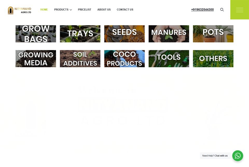
Business software often needs it most, because staff repeat the same screens many times a day. At a billing counter that means big buttons, few steps and totals that are easy to check while a queue waits. The billing app we built for Nityanand Agro runs on staff phones, works over patchy rural signal and prints receipts through a Bluetooth thermal printer.

Worth reading first

WEB & E-COMMERCE

Engineering you can build on.

Clean, documented, tested code on a modern, proven stack — the foundation that keeps your ui/ux design fast and dependable for years.

FigmaDesign systemsPrototypingWCAGUser researchFigmaDesign systemsPrototypingWCAGUser researchFigmaDesign systemsPrototypingWCAGUser researchFigmaDesign systemsPrototypingWCAGUser researchFigmaDesign systemsPrototypingWCAGUser researchFigmaDesign systemsPrototypingWCAGUser researchFigmaDesign systemsPrototypingWCAGUser researchFigmaDesign systemsPrototypingWCAGUser research
tokens.css
:root { --color-accent: #f35b22; --radius: 12px; } ✓ design system · 1 source of truth

Ready when you are

Let's build something that lasts.

Show us the screen that confuses people today, or describe the one you have not built yet, and we will send a clear design plan in writing: which screens, who tests them, and by when.

50+
projects shipped for local & global clients_
100%
of the code is yours to keep_
9
real, live projects on our work page — from our Udupi studio_
Whirl Designs assistantAnswers from this site · not a person
Ask about what the studio builds, how a project runs, or what would suit your business. I answer from this site, and I can pass you to the team any time.
WhatsApp us